Create A Custom UISegmentedControl In Swift
Have you gotten tired of the standard UISegmentedControl in swift, and just wish you could make it match your app's look and feel?
You've wondered how other developers create their own custom components from scratch. Maybe you wanted to add a little bit of animation to it as well.
In this tutorial you'll learn 3 major concepts:
- Creating Custom UIView's programmatically
- Use @IBDesignable and @IBInspectable to preview your custom components in the Storyboard
- Add basic animations to custom views
Getting Started
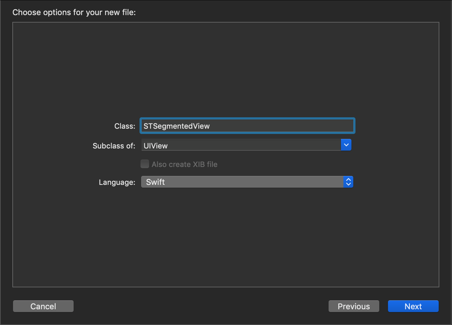
We begin by creating a new Cocoa Touch Class file which is a subclass of UIView. For this example I chose to name mine 'STSegmentedView'.
We start by creating the initializers for the class.
override init(frame: CGRect) {
    super.init(frame: frame)

}

required init?(coder aDecoder: NSCoder) {
    super.init(coder: aDecoder)

}
From here we're going to write a quick function which will return the main buttons we need for our custom view. We'll use this function when define and initialize those buttons.
func createSegmentButton() -> UIButton {
    let button = UIButton(type: .custom)
    button.setTitle("", for: .normal)
    button.titleLabel?.font = UIFont(name: "HelveticaNeue-Bold", size: 14)
    button.imageEdgeInsets = UIEdgeInsets(top: 0, left: -15, bottom: 0, right: 0)
    return button
}
Then go ahead and define those main UIButtons, as well as the UIStackView the buttons will be placed in.
// Main Buttons - (3 calls to 'createSegmentButon')
private lazy var buttons:[UIButton] = [self.createSegmentButton(), self.createSegmentButton(), self.createSegmentButton()]

// Will Contain Main UIButtons
lazy var stackView: UIStackView = UIStackView(arrangedSubviews: [])
Using @IBDesignable & @IBInspectable
Next we're going to starting using Swift Attributes to allow us to see and interact with our view while it's placed in the Storyboard.
If we apply the @IBDesignable attribute to our 'STSegmentedView' class and the @IBInspectable attribute to variables within the class, then we'll be able to assign values without ever having written a line of code.
Our class will look like this...
@IBDesignable class STSegmentedView: UIView {
...
}
...and our variables like this...
@IBInspectable var buttonText:[String] = []
Using the @IBInspectable attribute, we will create a few variables to hold the view's icons and labels. We will have variables for the button's text as well as a selected and non selected image for the buttons.
Note: I'm using 'didSet' in the variable initializer. This is a Property Observer in Swift. Every time this variable is written to, the 'didSet' closure will execute perform the code inside. For all cases here, we are simply consolidating the variables inside 3 arrays defined in the first 3 lines.
private var buttonTitles: [String] = ["Button", "Button", "Button"]
private var buttonImages: [UIImage] = [UIImage(), UIImage(), UIImage()]
private var buttonSelectImages: [UIImage] = [UIImage(), UIImage(), UIImage()]

// @IBInspectable Properties (Icons and Text)
@IBInspectable var leftText: String = "Button" {
    didSet {
        self.buttons[0].setTitle(leftText, for: .normal)
        self.buttonTitles[0] = leftText
    }
}

@IBInspectable var middleText: String = "Button" {
    didSet {
        self.buttons[1].setTitle(middleText, for: .normal)
        self.buttonTitles[1] = middleText
    }
}

@IBInspectable var rightText: String = "Button" {
    didSet {
        self.buttons[2].setTitle(rightText, for: .normal)
        self.buttonTitles[2] = rightText
    }
}

@IBInspectable var leftImage: UIImage = UIImage() {
    didSet {
        self.buttons[0].setImage(leftImage, for: .normal)
        self.buttonImages[0] = leftImage
    }
}

@IBInspectable var middleImage: UIImage = UIImage() {
    didSet {
        self.buttons[1].setImage(middleImage, for: .normal)
        self.buttonImages[1] = middleImage
    }
}

@IBInspectable var rightImage: UIImage = UIImage() {
    didSet {
        self.buttons[2].setImage(rightImage, for: .normal)
        self.buttonImages[2] = rightImage
    }
}

@IBInspectable var leftImageSelected: UIImage = UIImage() {
    didSet {
        self.buttonSelectImages[0] = leftImageSelected
    }
}

@IBInspectable var middleImageSelected: UIImage = UIImage() {
    didSet {
        self.buttonSelectImages[1] = middleImageSelected
    }
}

@IBInspectable var rightImageSelected: UIImage = UIImage() {
    didSet {
        self.buttonSelectImages[2] = rightImageSelected
    }
}
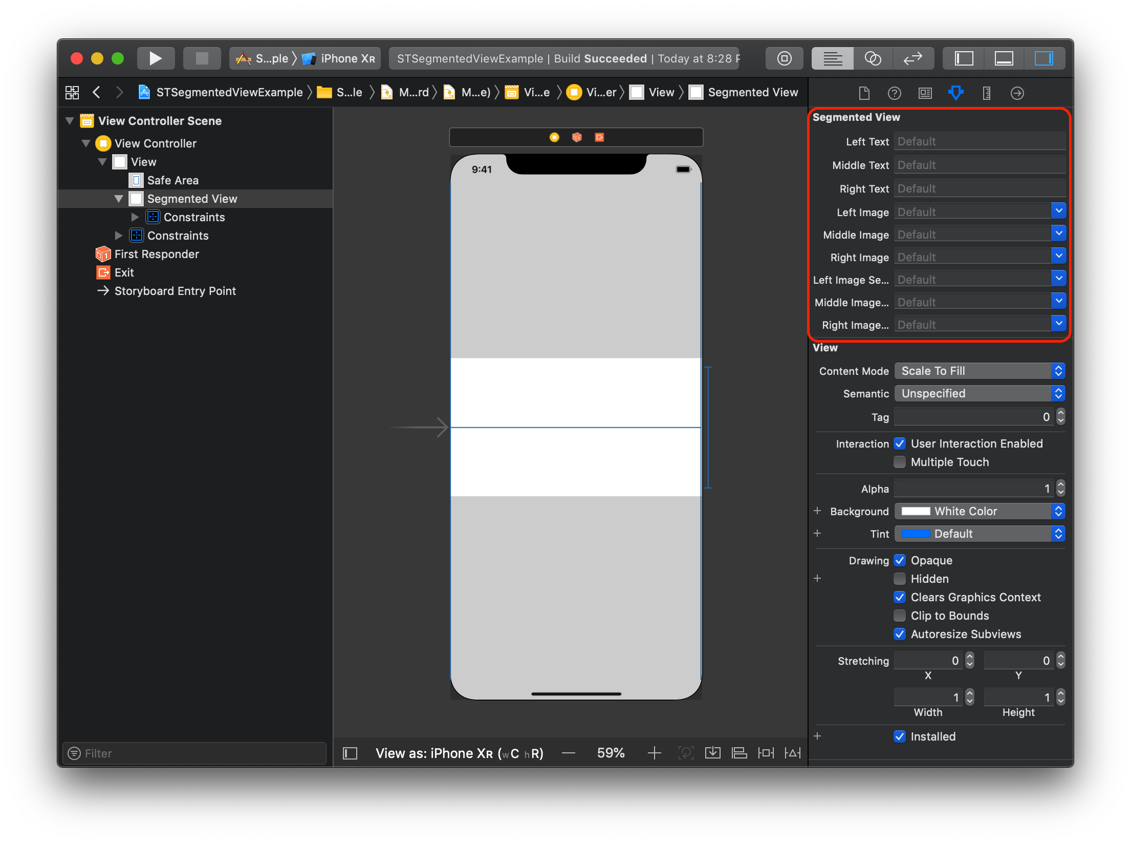
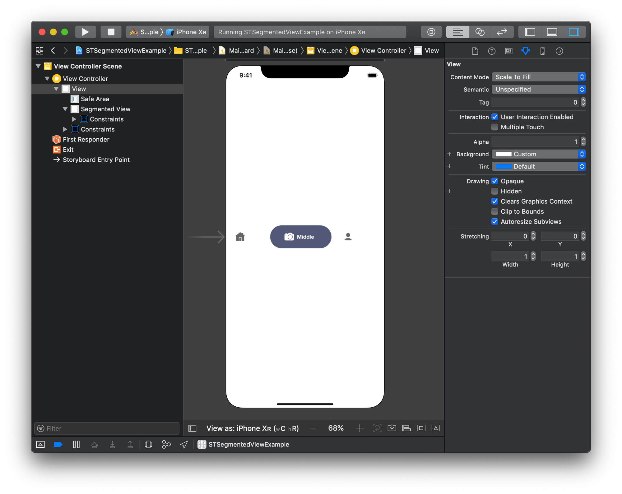
Now if you switch over to the Storyboard and add our custom view you can see the @IBInspectable properties available in the sidebar.
Adding the buttons to our custom view
Next up we will define a function 'setupView' which will add all of the above objects to our custom view.
// Called When the view is instantiated.
func setupView() {

    // Assign Variable to Arrays
    self.buttonTitles = [leftText, middleText, rightText]
    self.buttonImages = [leftImage, middleImage, rightImage]
    self.buttonSelectImages = [leftImageSelected, middleImageSelected, rightImageSelected]

    var x = 0 // Button Title Index
    for button in buttons {
        // Set Button Title
        button.setTitle(buttonTitles[x], for: .normal)
        x += 1

        // Resize the Button and add to StackView
        button.sizeToFit()
        stackView.addArrangedSubview(button)
    }

    // Setup the properties of the StackView
    stackView.axis = .horizontal
    stackView.distribution = .fillProportionally
    stackView.alignment = .fill
    stackView.translatesAutoresizingMaskIntoConstraints = false

    // Add StackView to View
    self.addSubview(stackView)

    // Pin the StackView to All edges of the View
    stackView.leadingAnchor.constraint(equalTo: self.leadingAnchor).isActive = true
    stackView.trailingAnchor.constraint(equalTo: self.trailingAnchor).isActive = true
    stackView.topAnchor.constraint(equalTo: self.topAnchor).isActive = true
    stackView.bottomAnchor.constraint(equalTo: self.bottomAnchor).isActive = true


}
Let's walkthrough this function piece by piece.
- We first assign all of the text and image variables to their designated arrays. We do this to make sure we have the correct information set by the user in the Storyboard.
- We take the titles given by the user and assign them on the button labels. Then resize the button to the given text and add it to the StackView.
- We change the properties of the StackView so that it horizontal and handling it's subviews in the way we want it to.
- Finally we add the StackView to our custom view and pin its edges to the view so it spans the entire space.
Finally call the 'setupView' function in both of our view's initializers like so.
override init(frame: CGRect) {
    super.init(frame: frame)
    setupView()
}

required init?(coder aDecoder: NSCoder) {
    super.init(coder: aDecoder)
    setupView()
}
Now if you go back to the Storyboard and change the text properties...
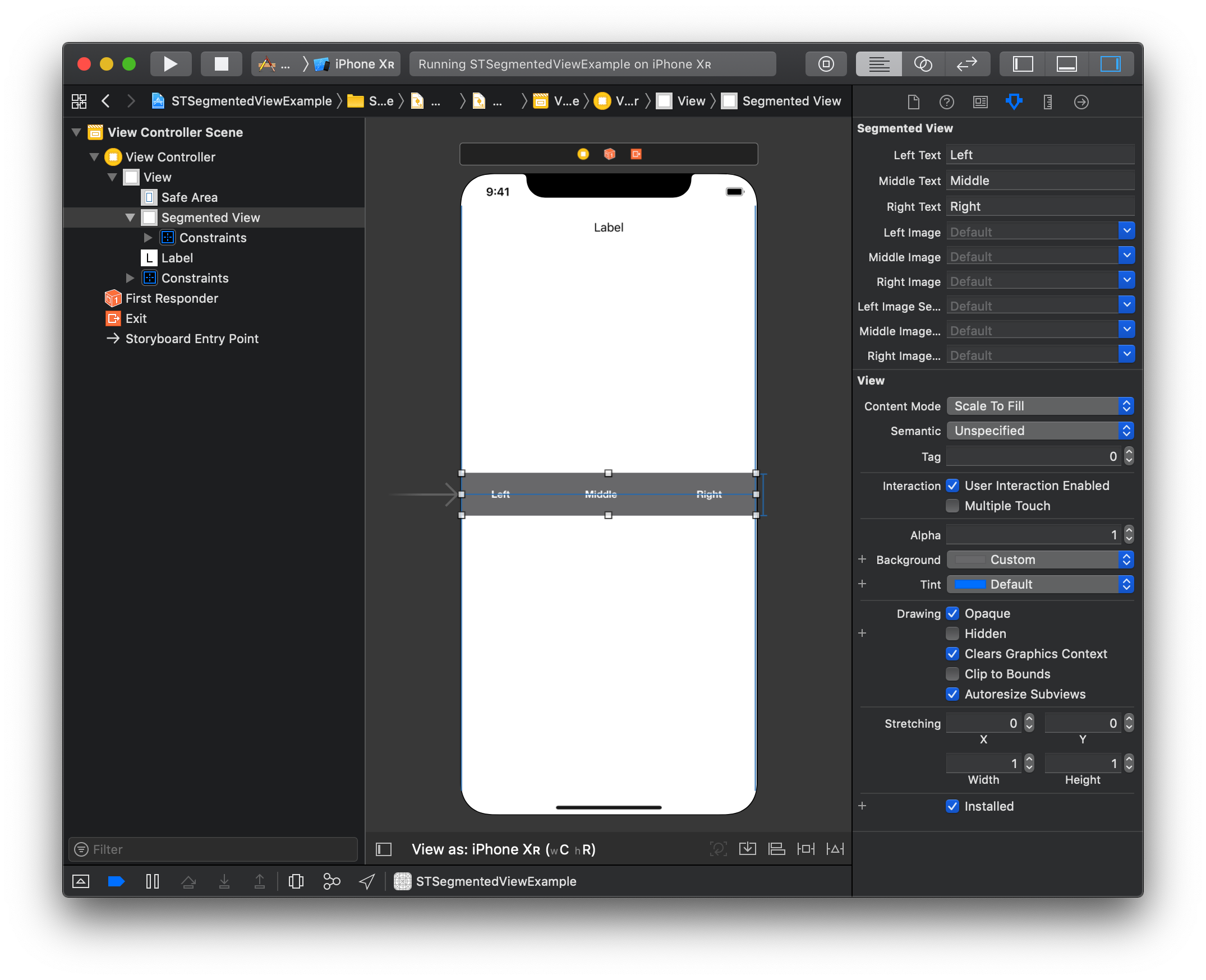
The View will update live in the Storyboard. (Note: I also changed the background color of the view for viewing purposes)
Let's move onto the icons!... But first, go ahead and the below functions. They will be used to setup the first button selection the user wants.
override func layoutSubviews() {
    super.layoutSubviews()
    self.setupFirstSelection()
}

func setupFirstSelection() {

}
The next bit of code is going to be added to our class to allow us to select the proper button when the view is created.
private var currentIndex: Int = 0
//...
// Sliding View which falls behind the currently selected button
lazy var slideView: UIView = {
    var view = UIView(frame: CGRect.zero)
    view.backgroundColor = self.selectedBackgroundColor
    return view
}()
//...
@IBInspectable var selectedBackgroundColor:UIColor = UIColor.blue {
    didSet {
        self.slideView.backgroundColor = selectedBackgroundColor
    }
}
@IBInspectable var selectedTextColor:UIColor = UIColor.white
//...
@IBInspectable var startingIndex: Int = 0
//...
func setupFirstSelection() {
    let index = self.startingIndex
    let newButton = self.buttons[index]
    newButton.setTitle(self.buttonTitles[index], for: .normal)
    newButton.setImage(self.buttonSelectImages[index], for: .normal)

    self.stackView.layoutSubviews()
    self.slideView.frame = newButton.frame
    self.slideView.layer.cornerRadius = self.slideView.frame.height/2.0

    self.currentIndex = index

}
//...
func didSelectButton(at index: Int) {
    // Add selection code here...
}
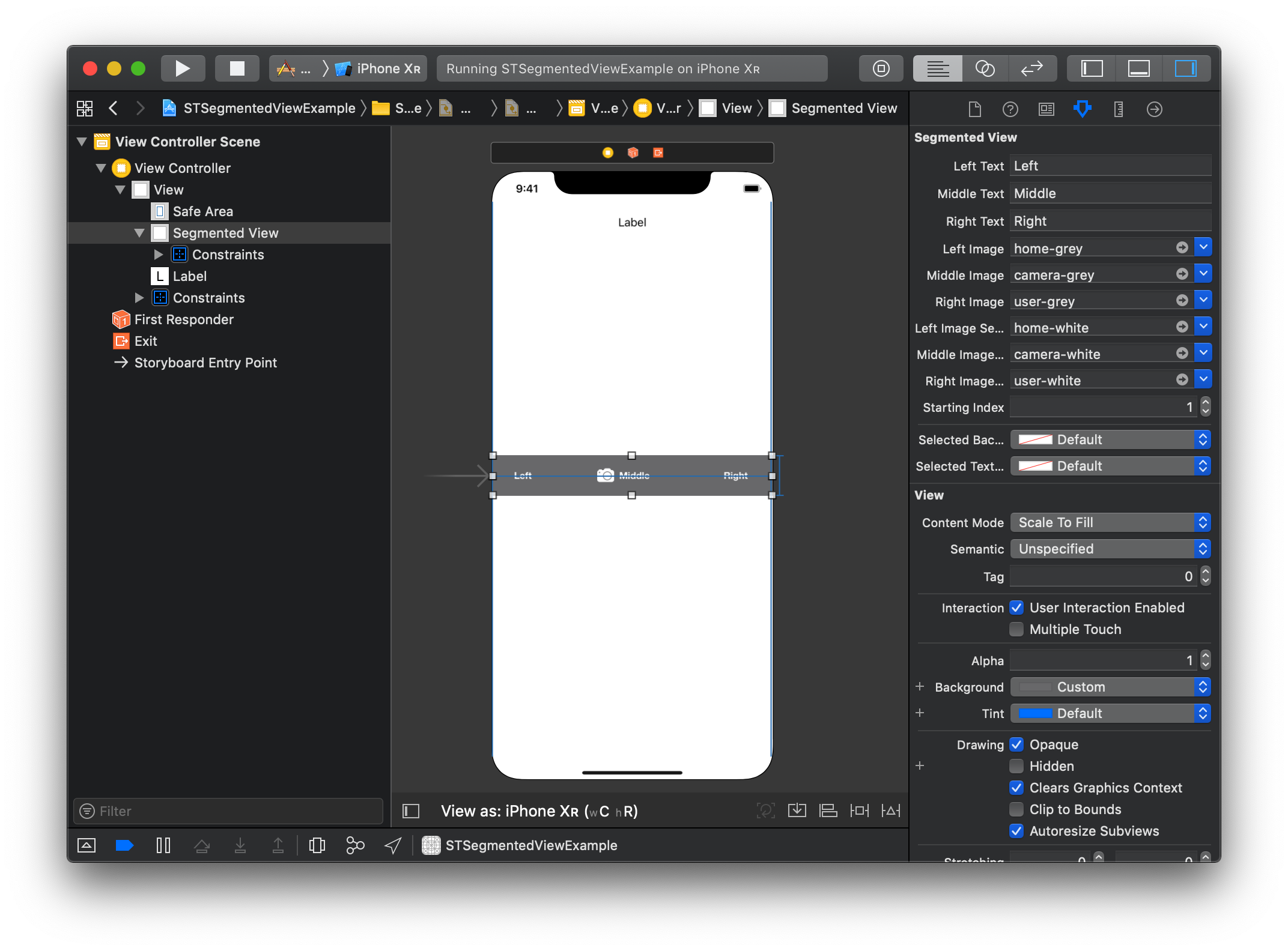
Now if you switch over to the Storyboard, you can see the changes. (Make sure you add some images and select a starting index too)
Finally by adding the animation code inside the 'didSelectButton' function, you can animate the changes.
See my code below.
func didSelectButton(at index: Int) {

    let oldButton = self.buttons[self.currentIndex]

    let newButton = self.buttons[index]

    newButton.alpha = 0.0

    // Change from selected image to regular and vice versa.
    oldButton.setImage(self.buttonImages[self.currentIndex], for: .normal)
    newButton.setImage(self.buttonSelectImages[index], for: .normal)

    // Animate the button title changes
    UIView.animate(withDuration: 0.1) {
        oldButton.setTitle("", for: .normal)
        newButton.setTitle(self.buttonTitles[index], for: .normal)
        self.stackView.layoutSubviews()
        self.layoutIfNeeded()
        newButton.alpha = 1.0
    }

    // Animate the slide view moving from one button to the next
    UIView.animate(withDuration: 0.2, delay: 0, options: [], animations: {
        self.slideView.frame = newButton.frame
        self.layoutIfNeeded()
    }, completion: nil)


    self.currentIndex = index

}
As you can see the old button is identified by our saved index. We remove th etext from it and change it's image back to its regular unselected image. We then do the opposite for the Selected button.
Additionally, we animate the position of the slideView by placing it at the same position as the selected button.
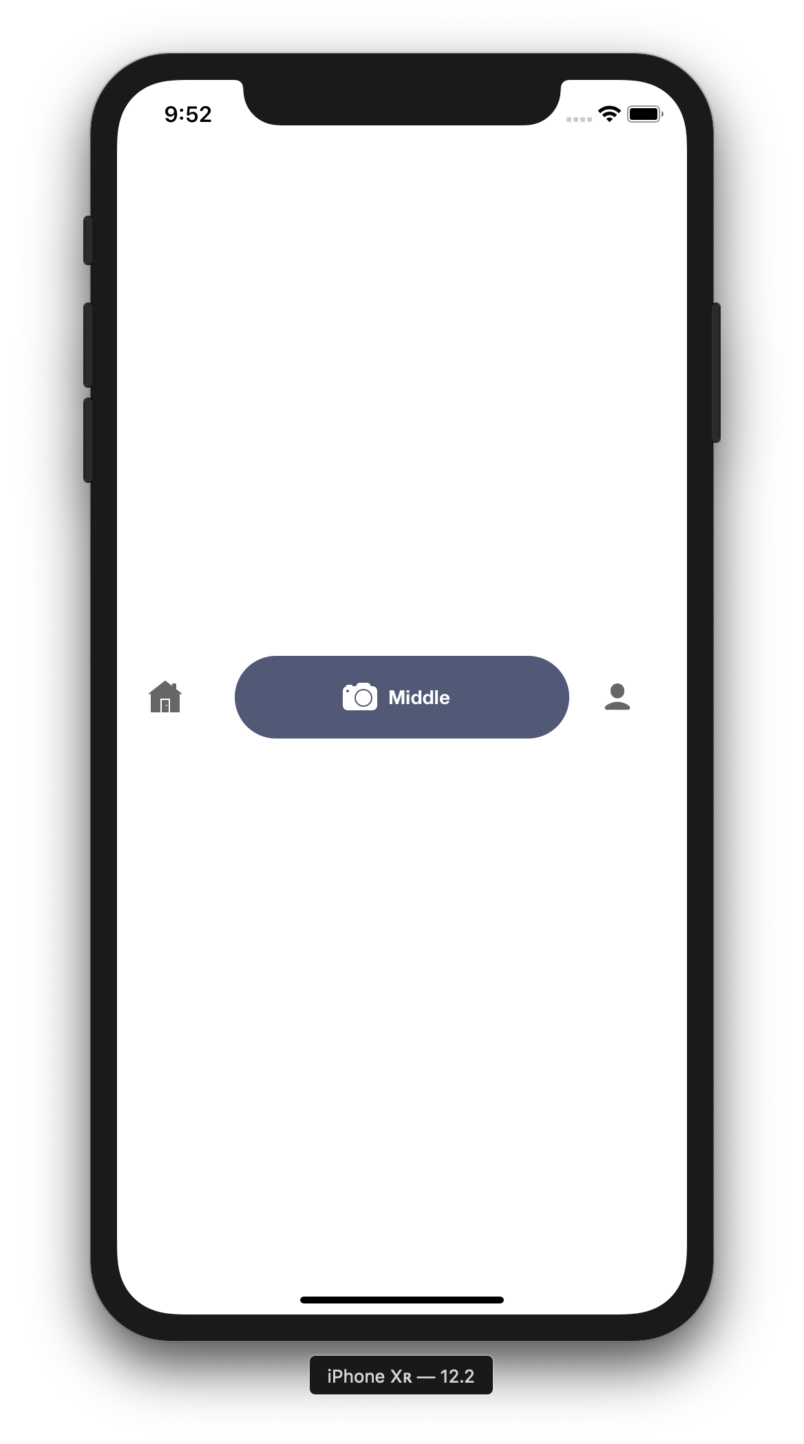
If you open up the Storyboard you can see the final updates.
And if you run the application.
I'll leave it as an exercise to the reader to add in code that will change other parts of the view depending on which button is selected. (Hint: I Used a Protocol to help me out)
Final Code
You can see the final product on GitHub