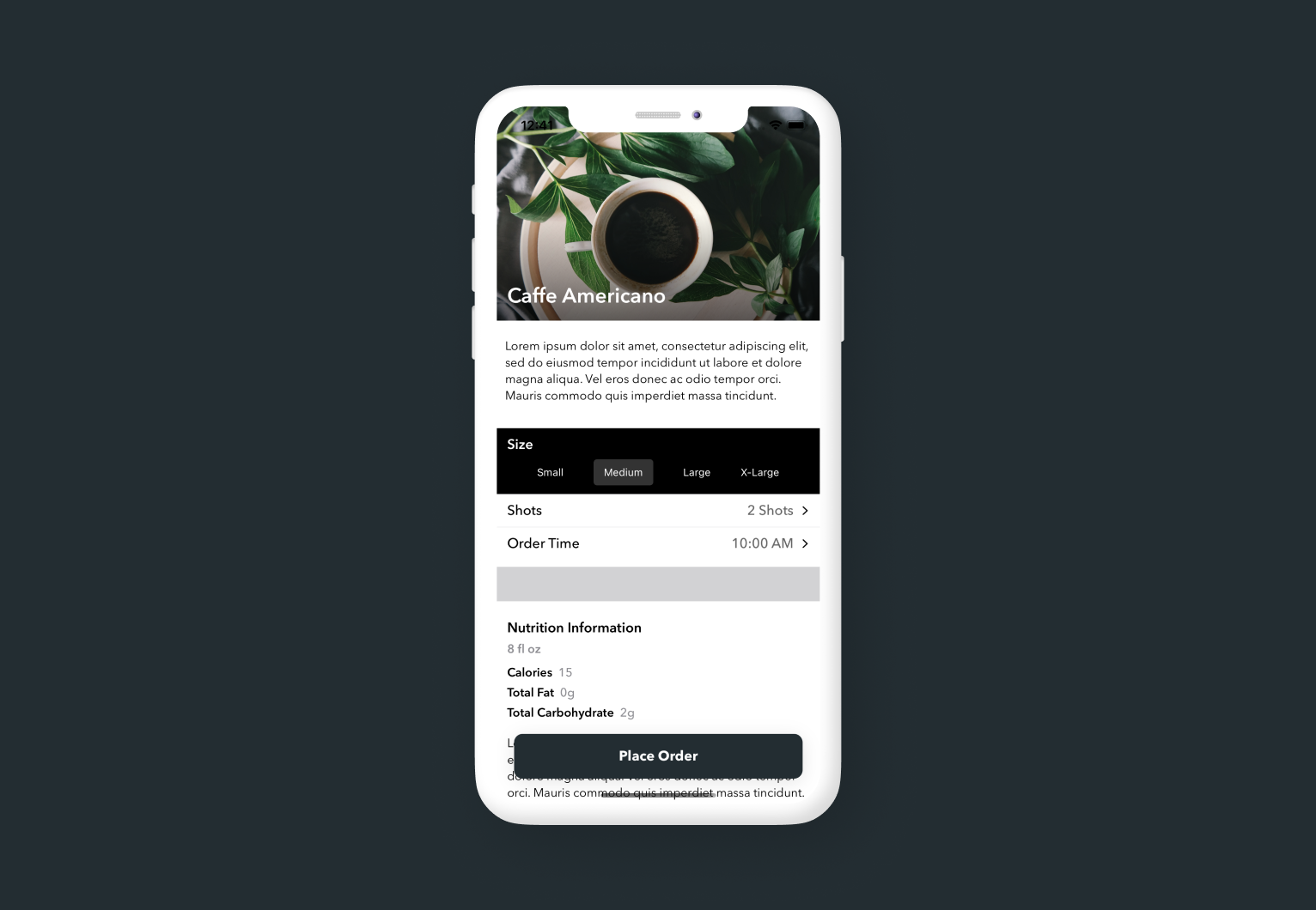
The default Pickers in SwiftUI don't leave you much opportunity for styling or customization. Today I'll walk through creating a custom dropdown picker that you can use in your next iOS project.
If you found this tutorial helpful, please consider subscribing using this link, and if you aren't reading this on TrailingClosure.com, please come check us out sometime!
Creating DropdownPicker
Start off by creating a new SwiftUI View named DropdownPicker. Like the built-in iOS picker we'll need to keep track of a few things. First the title of the picker, the available options the user may select, and finally the user's current selection. The selection variable will be a binding so that the parent view can keep track of the user's selections.
struct DropdownPicker: View {
var title: String
@Binding var selection: Int
var options: [String]
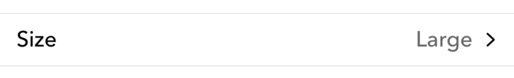
}The next step is to start building out the body of the view. Below is a picture of what the DropdownPicker will look like when it's closed.
var body: some View {
    HStack {
        Text(title)
        Spacer()
        Text(options[selection])
            .foregroundColor(Color.black.opacity(0.6))
        Image(systemName: "chevron.right")
            .resizable()
            .aspectRatio(contentMode: .fit)
            .frame(width: 10, height: 10)
    }
    .font(Font.custom("Avenir Next", size: 16).weight(.medium))
    .padding(.horizontal, 12)
    .padding(.vertical, 8)
    .background(Color.white)
}
Here we place the title and current selection of our picker in an HStack. I've gone ahead and added some styling to spruce up the row such as customizing the font, adding padding, as well as placing a chevron on the trailing edge to denote our row is selectable.
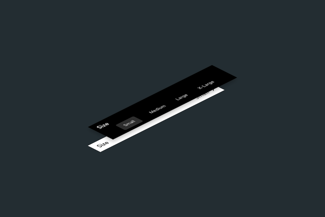
Adding the Dropdown Options
The next step is to build out the view which shows the user the options to select. For the DropdownPicker we're going to overlay the options using a ZStack and dynamically show them using a @State variable called showOptions.
Start off by declaring that new state variable called showOptions inside the DropdownPicker struct.
struct DropdownPicker: View {

    var title: String
    @Binding var selection: Int
    var options: [String]

    @State private var showOptions: Bool = false

    // Body below...
    // ...
}
Then wrap everything inside body with a ZStack.
var body: some View {
    ZStack {
        HStack {
            Text(title)
            Spacer()
            Text(options[selection])
                //.foregroundColor(Color(red: 2/255, green: 99/255, blue: 195/255))
                .foregroundColor(Color.black.opacity(0.6))
            Image(systemName: "chevron.right")
                .resizable()
                .aspectRatio(contentMode: .fit)
                .frame(width: 10, height: 10)
        }
        .font(Font.custom("Avenir Next", size: 16).weight(.medium))
        .padding(.horizontal, 12)
        .padding(.vertical, 8)
        .background(Color.white)

        // Dropdown options here...
    }
}
Next we'll add the code for the dropdown. Since we want to dynamically show the options, we're going to use the showOptions as the condition of an if statement.
var body: some View {
    ZStack {
        // ...
        // View code for closed row above

    	// Dropdown view code
    	if showOptions {

    	}
    }
}
Then add in the VStack for the title and options...
var body: some View {
    ZStack {
        // ...
        // View code for closed row above

    	// Dropdown view code
    	if showOptions {
            VStack(alignment: .leading, spacing: 4) {
                Text(title)
                    .font(Font.custom("Avenir Next", size: 16).weight(.semibold))
                    .foregroundColor(.white)
                HStack {
                    // options here
                }
                .padding(.vertical, 2)
                .transition(AnyTransition.move(edge: .top).combined(with: .opacity))
            }
    	}
    }
}
Finally, we can build out the HStack with the options array. My code's below with all of the styling I used in my mockup. Feel free to customize to your liking and play around with it.
var body: some View {
    ZStack {
        // ...
        // View code for closed row above

    	// Dropdown view code
    	if showOptions {
            VStack(alignment: .leading, spacing: 4) {
                Text(title)
                    .font(Font.custom("Avenir Next", size: 16).weight(.semibold))
                    .foregroundColor(.white)
                HStack {
                    Spacer()
                    ForEach(options.indices, id: \.self) { i in
                        if i == selection {
                            Text(options[i])
                                .font(.system(size: 12))
                                .padding(.vertical, 8)
                                .padding(.horizontal, 12)
                                .background(Color.white.opacity(0.2))
                                .cornerRadius(4)
                        } else {
                            Text(options[i])
                                .font(.system(size: 12))
                        }
                        Spacer()

                    }
                }
                .padding(.vertical, 2)
                .transition(AnyTransition.move(edge: .top).combined(with: .opacity))
            }
    	}
    }
}
Adding in the Tap Gestures
We're only missing one thing in our DropdownPicker. We haven't actually given it the ability to show the dropdown options to the user. Right now if you tap the row, nothing happens. The final piece is to add tap gestures to the static row as well as to the options in the dropdown. Here's the final view code for the DropdownPicker.
import SwiftUI

struct DropdownPicker: View {

    var title: String
    @Binding var selection: Int
    var options: [String]

    @State private var showOptions: Bool = false

    var body: some View {
        ZStack {
            // Static row which shows user's current selection
            HStack {
                Text(title)
                Spacer()
                Text(options[selection])
                    .foregroundColor(Color.black.opacity(0.6))
                Image(systemName: "chevron.right")
                    .resizable()
                    .aspectRatio(contentMode: .fit)
                    .frame(width: 10, height: 10)
            }
            .font(Font.custom("Avenir Next", size: 16).weight(.medium))
            .padding(.horizontal, 12)
            .padding(.vertical, 8)
            .background(Color.white)
            .onTapGesture {
                // show the dropdown options
                withAnimation(Animation.spring().speed(2)) {
                    showOptions = true
                }
            }

            // Drop down options
            if showOptions {
                VStack(alignment: .leading, spacing: 4) {
                    Text(title)
                        .font(Font.custom("Avenir Next", size: 16).weight(.semibold))
                        .foregroundColor(.white)
                    HStack {
                        Spacer()
                        ForEach(options.indices, id: \.self) { i in
                            if i == selection {
                                Text(options[i])
                                    .font(.system(size: 12))
                                    .padding(.vertical, 8)
                                    .padding(.horizontal, 12)
                                    .background(Color.white.opacity(0.2))
                                    .cornerRadius(4)
                                    .onTapGesture {
                                        // hide dropdown options - user selection didn't change
                                        withAnimation(Animation.spring().speed(2)) {
                                            showOptions = false
                                        }
                                    }
                            } else {
                                Text(options[i])
                                    .font(.system(size: 12))
                                    .onTapGesture {
                                        // update user selection and close options dropdown
                                        withAnimation(Animation.spring().speed(2)) {
                                            selection = i
                                            showOptions = false
                                        }
                                    }
                            }
                            Spacer()
                        }
                    }
                    .padding(.vertical, 2)
                    .transition(AnyTransition.move(edge: .top).combined(with: .opacity))

                }
                .padding(.horizontal, 12)
                .padding(.vertical, 8)
                .background(Color.black)
                .foregroundColor(.white)
                .transition(.opacity)

            }

        }
    }
}
Example use
DropdownPicker(title: "Size", selection: $selection, options: ["Small", "Medium", "Large", "X-Large"])Like this tutorial?
Show us what you've made!
Send us pics! Drop us a link! Anything! Find us on Twitter @TrailingClosure, on Instagram, or email us at [email protected].
Coffee photo in SwiftUI mockup by Brigitte Tohm on Unsplash