
AlignmentControl with animationsFor the next few posts I'm going to cover a few micro-interactions that I've made for my apps. The benefits these interactions bring can really help make your app feel polished and simple to use. As we get started these examples should help get you thinking about what's possible in your app. As we dive in, I encourage you to mess around with the code to really get a view for what's possible and looks good.
AlignmentControl
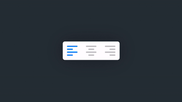
This simple button animates text alignment selection using Rectangle views stacked on top of one another. The beauty of this AlignmentControl is that we can actually use SwiftUI's built in HorizontalAlignment to build the AlignmentButton which composes the entire AlignmentControl.
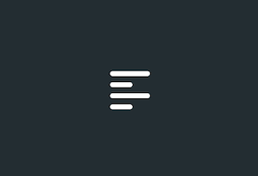
AlignmentButton with leading alignmentstruct AlignmentButton : View {
var alignment: HorizontalAlignment
var action: ()->()
var body: some View {
Button(action: action, label: {
VStack(alignment: alignment, spacing: 4) {
AlignmentLine()
AlignmentLine()
.frame(width: 14, height: 3, alignment: .center)
.cornerRadius(1.5)
AlignmentLine()
AlignmentLine()
.frame(width: 14, height: 3, alignment: .center)
.cornerRadius(1.5)
}
})
}
}
Combining Multiple Buttons
Then by putting multiple buttons together in an HStack, we create much of the basis for the full AlignmentControl. All that is left after this is to create the animation which displays which alignment is active.
You'll see one of the properties for the
AlignmentButtonis closure named "action", which we'll use to update the alignment on selection. See below for an example of how it's used.
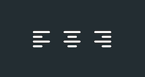
AlignmentButtons as a stackvar body: some View {
ZStack(alignment: Alignment(horizontal: alignment, vertical: .center)) {
HStack (spacing: 20) {
AlignmentButton(alignment: .leading) {
alignment = .leading
textAlignment = .leading
}
AlignmentButton(alignment: .center) {
alignment = .center
textAlignment = .center
}
AlignmentButton(alignment: .trailing) {
alignment = .trailing
textAlignment = .trailing
}
}
}
}
Adding Selection Animation
In order to show the user's current selection, I place an additional stack of Rectangles on top of the AlignmentButtons. This stack will move according to the overall HorizontalAlignment of the ZStack it's inside.
var body: some View {
    ZStack(alignment: Alignment(horizontal: alignment, vertical: .center)) {

        // Alignment Buttons
        HStack (spacing: 20) {
            AlignmentButton(alignment: .leading) {
                alignment = .leading
                textAlignment = .leading
            }

            AlignmentButton(alignment: .center) {
                alignment = .center
                textAlignment = .center
            }
            AlignmentButton(alignment: .trailing) {
                alignment = .trailing
                textAlignment = .trailing
            }
        }

        // Selection Stack
        VStack(alignment: alignment, spacing: 4) {
            AlignmentLine()
                .animation(Animation.easeOut)
            AlignmentLine()
                .frame(width: 14, height: 3, alignment: .center)
                .cornerRadius(1.5)
                .animation(Animation.easeOut.delay(0.03))
            AlignmentLine()
                .animation(Animation.easeOut.delay(0.06))
            AlignmentLine()
                .frame(width: 14, height: 3, alignment: .center)
                .cornerRadius(1.5)
                .animation(Animation.easeOut.delay(0.09))
        }
    }
}
This covers the basics of setting up the control. If you'd like to see the full code where I include options for customizing the colors of the control, then see the source code below.
Source Code
You can find the full source code as a Github gist here.
Example Use
Here's an example where I use the control to dynamically change the text alignment of the paragraph.
//
//  AlignmentControl_Test.swift
//  MicroAnimations_Test
//
//  Created by Jean-Marc Boullianne on 8/28/20.
//

import SwiftUI

struct AlignmentControl_Test: View {

    @State var alignment: TextAlignment = .leading

    var body: some View {
        ZStack {
            Color(red: 35/255, green: 45/255, blue: 50/255)
            VStack(spacing: 20) {
                AlignmentControl(alignment: $alignment, tintColor: Color(red: 0, green: 128/255, blue: 1), baseColor: Color.gray.opacity(0.6))
                    .padding(.all, 10)
                    .background(Color.white)//Color(red: 35/255, green: 45/255, blue: 50/255))
                    .cornerRadius(5)
                    .shadow(color: Color.black.opacity(0.3), radius: 20, x: 0, y: 0)

                Text("Lorem ipsum dolor sit amet, consectetur adipiscing elit, sed do eiusmod tempor incididunt ut labore et dolore magna aliqua. Neque vitae tempus quam pellentesque nec. Sit amet consectetur adipiscing elit. Quis risus sed vulputate odio ut enim blandit volutpat. Vitae suscipit tellus mauris a diam maecenas. Eu turpis egestas pretium aenean pharetra magna ac placerat vestibulum. Vel risus commodo viverra maecenas accumsan lacus vel facilisis volutpat.")
                    .font(.body)
                    .fontWeight(.medium)
                    .foregroundColor(.white)
                    .multilineTextAlignment(alignment)
                    .animation(.easeInOut)

            }.padding(.all, 20)
        }
    }
}