Creating the ComboSlider
- Create the
ComboSliderView class by creating a new SwiftUI View and naming itComboSlider. - Add two member variables for the color of the slider.
@State var inactiveColor:Color // Background of Slider
@State var activeColor:Color // Active portion of Slider
- Inside the
bodyreplace theTextwith aGeometryReaderand aZStackinside. This will be the container for out slider. We are going to place down the background of the slider first, and then overlay the top active color as well as the the buttons.
struct ComboSlider: View {

    @State var inactiveColor:Color // Background of Slider
    @State var activeColor:Color // Active portion of Slider

    var body: some View {
        GeometryReader { geometry in
            ZStack(alignment: .center) {
                // Background here
                // Active Overlay here
                // Buttons here
            }

        }
    }
}
-
Starting with the easy one. We need to add the background of the slider. Right under the first comment 'Background here' place a
Rectangleand modify itsforegroundColorto use theinactiveColorwe defined earlier. -
Next is to add the active overlay portion of the slider. Cut and paste the code from the background
Rectangleand change theforegroundColorto theactiveColor. -
Finally add two
Circleobjects below and change theirforegroundColorto theactiveColoras well. Here's what we have.
var body: some View {
    GeometryReader { geometry in
        ZStack(alignment: .center) {
            // Background here
            Rectangle()
                .foregroundColor(self.inactiveColor)

            // Active Overlay here
            Rectangle()
                .foregroundColor(self.activeColor)

            // Buttons here
            Circle()
                .foregroundColor(self.activeColor)

            Circle()
                .foregroundColor(self.activeColor)
        }

    }
}
For testing your view you can use this:
struct ComboSlider_Previews: PreviewProvider {

    static let c1 = Color.gray
    static let c2 = Color.green

    static var previews: some View {
        ComboSlider(inactiveColor: c1, activeColor: c2)
    }
}
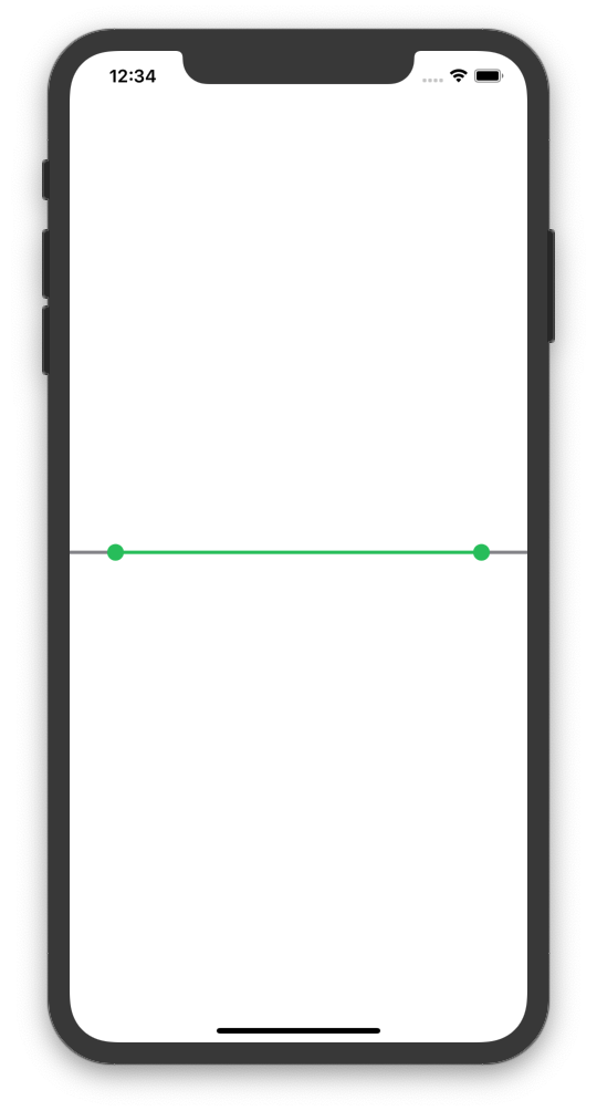
And when testing it in the simulator... boring...
I promise it'll get better soon.
Adding some style
We're going to start off in the next part by defining 5 new member variables at the top of our class. These variables will help us properly layout our view to look more like a slider.
@State var barheight:CGFloat = 10 // Slider Bar Height
@State var buttonDiameter:CGFloat = 20 // Slider Button Diameter

// Position Of Buttons (Scale of 0-1)
@Binding var pos1:CGFloat
@Binding var pos2:CGFloat
var widthFactor:CGFloat { return pos2 - pos1 } // Factor for how wide the overlay is
Now to modify the body
- Make the inactive and active
Rectangles the correct height and width by modifying theirFrame.
// Background here
Rectangle()
    .foregroundColor(self.inactiveColor)
    .frame(width: nil, height: self.barheight, alignment: .center)

// Active Overlay here
Rectangle()
    .foregroundColor(self.activeColor)
    .frame(width: geometry.size.width * self.widthFactor, height: self.barheight, alignment: .center)
- Now to position the active
Rectanglecorrectly horizontally. You can see we used thepos1variable to move theRectangleover and accounted for the center positioning by using thewidthFactor.
// Active Overlay here
Rectangle()
    .foregroundColor(self.activeColor)
    .frame(width: geometry.size.width * self.widthFactor, height: self.barheight, alignment: .center)
    .position(x: geometry.size.width * (self.pos1 + (self.widthFactor/2.0)), y: geometry.size.height/2.0)
- Finally we're going to do a similar thing with the
CircleButtons.
// Buttons here
Circle()
    .foregroundColor(self.activeColor)
    .frame(width: self.buttonDiameter, height: self.buttonDiameter, alignment: .center)
    .position(x: geometry.size.width * self.pos1, y: geometry.size.height/2.0)

Circle()
    .foregroundColor(self.activeColor)
    .frame(width: self.buttonDiameter, height: self.buttonDiameter, alignment: .center)
    .position(x: geometry.size.width * self.pos2, y: geometry.size.height/2.0)
- Update your preview code with this:
struct ComboSlider_Previews: PreviewProvider {

    static let c1 = Color.gray
    static let c2 = Color.green

    @State static var pos1:CGFloat = 0.2
    @State static var pos2:CGFloat = 0.9


    static var previews: some View {
        ComboSlider(inactiveColor: c1, activeColor: c2, pos1: $pos1, pos2: $pos2)
    }
}
Go ahead and load the preview to see what we have.
As you can see we're starting to look more like a slider and less like colored Rectangles at this point. Woohoo!
Adding the Slide Functionality
In order for the Circle Buttons to slide we will need to attach a DragGesture to each. See below for the implementation.
// Buttons here
Circle()
    .foregroundColor(self.activeColor)
    .frame(width: self.buttonDiameter, height: self.buttonDiameter, alignment: .center)
    .position(x: geometry.size.width * self.pos1, y: geometry.size.height/2.0)
    .gesture(DragGesture()
        .onChanged({ value in
            // Caluclate the scaled position
            let newPos = value.location.x / geometry.size.width

            // Set new Position
            if newPos < 0 { self.pos1 = 0 }
            else if newPos > self.pos2 { self.pos1 = self.pos2 - 0.01 }
            else { self.pos1 = newPos }
        })
    )


Circle()
    .foregroundColor(self.activeColor)
    .frame(width: self.buttonDiameter, height: self.buttonDiameter, alignment: .center)
    .position(x: geometry.size.width * self.pos2, y: geometry.size.height/2.0)
    .gesture(DragGesture()
        .onChanged({ value in
            // Caluclate the scaled position
            let newPos = value.location.x / geometry.size.width

            // Set new Position
            if newPos > 1.0 { self.pos2 = 1.0 }
            else if newPos < self.pos1 { self.pos2 = self.pos1 + 0.01 }
            else { self.pos2 = newPos }
        })
    )
To explain the onChanged() function, let's walk through ti line by line.
- This converts the x location of the user's finger to the scaled positon of the slider. Remmber our slider uses the range 0-1 for values, whereas the
DragGestureuses the x location within the view.
let newPos = value.location.x / geometry.size.width
- This stops the slider from setting it's position outside of our range.
if newPos > 1.0 { self.pos2 = 1.0 }
- This stops the slider from setting it's position above or below the bounds of the other
CircleButton.
else if newPos < self.pos1 { self.pos2 = self.pos1 + 0.01 }
- If the x location doesn't fit the above criteria it just uses it's scaled position from line 1.
else { self.pos2 = newPos }
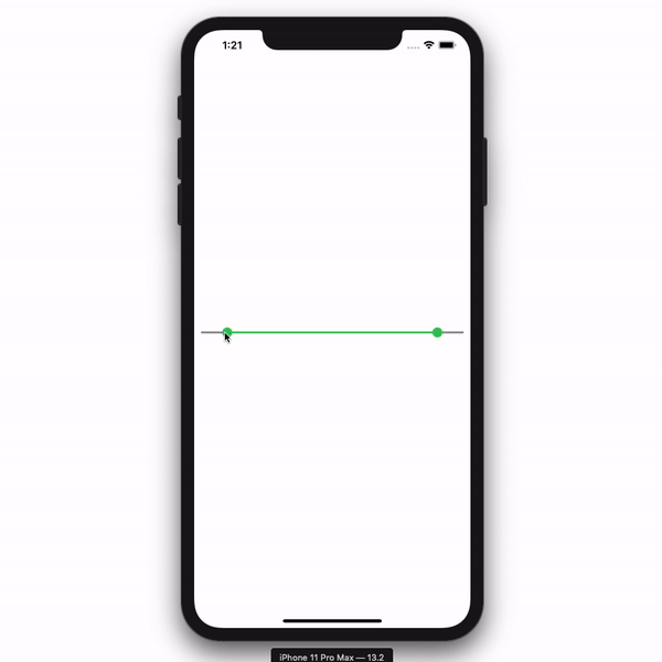
Take it for a spin in the emulator!
Running our current code gives us this. Nice. 😎
Constructing the Bar Graph
Inside this view we're going to be creating the bar graph that sits just behind the ComboSlider. When the ComboSlider changes, the bar graph will respond by highlighting the active segments and changing the opacity of the inactive ones. Let's get started.
- Create a new SwiftUI View and name it
BarGraph. - Inside the
bodyvariable remove the template and replace it with aGeometryReader. Inside that place anHStack.
var body: some View {
    GeometryReader { geometry in
        HStack(alignment: .center, spacing: 2) {
            // Bars go here
        }
    }
}
- Now we needs some values to work with. Up at the top declare an array of
CGFloats namedvalues. We're going to use this as the data for our bar graph. We'll also need to pull the max value out of the data in order to properly scale our bar graph.
@State var values:[CGFloat]
var maxVal:CGFloat{
    return self.values.max() ?? 0
}
- Now back to creating the bars. We're going to create our bars as
Rectangleobjects and then push them to the bottom of the view. As you can see below we loop through the data and then place aRectanglein aVStackwith a spacer. TheRectangleis scaled using the current value as well as themaxValue.
var body: some View {
    GeometryReader { geometry in
        HStack(alignment: .center, spacing: 2) {
            ForEach(self.values.indices) { x in
                VStack {
                    Spacer()
                    Rectangle()
                    .frame(width: (geometry.size.width / CGFloat(self.values.count)) - 2, height: geometry.size.height * (self.values[x] / self.maxVal) , alignment: .center)
                }

            }
        }
    }
}
Now use this preview code:
struct BarGraph_Previews: PreviewProvider {
    static var previews: some View {
        BarGraph(values: [0,0,1,2,3,4,7,4,5,6,10,5,3,2,1,0,0,1,2,1,0,0])
    }
}
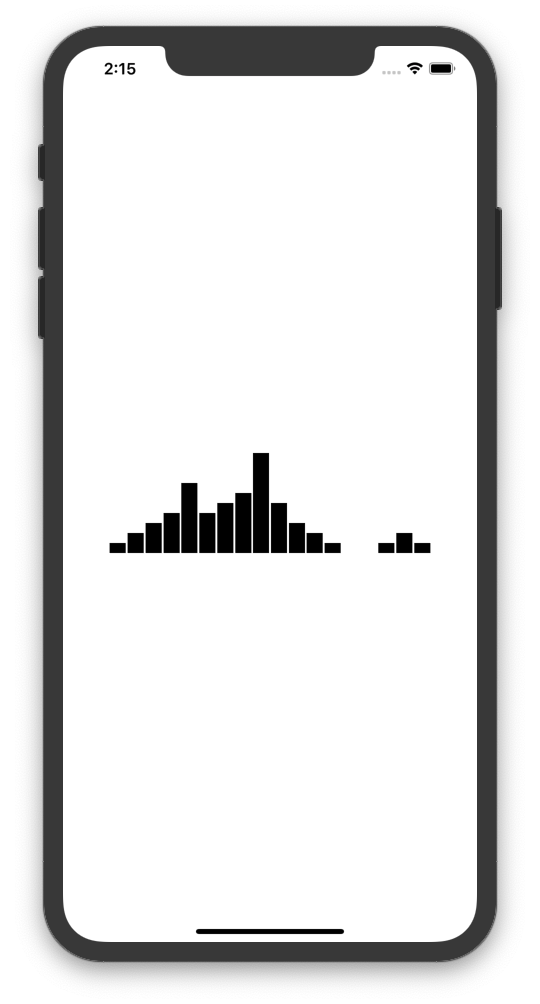
...and bam! You have yourself a bar graph. Easy right?
Add some color...
Add the following to the top of you BarGraph class.
// Position of active bars. Range (0-1)
@Binding var pos1:CGFloat
@Binding var pos2:CGFloat

@State var activeColor:Color
@State var inactiveColor:Color
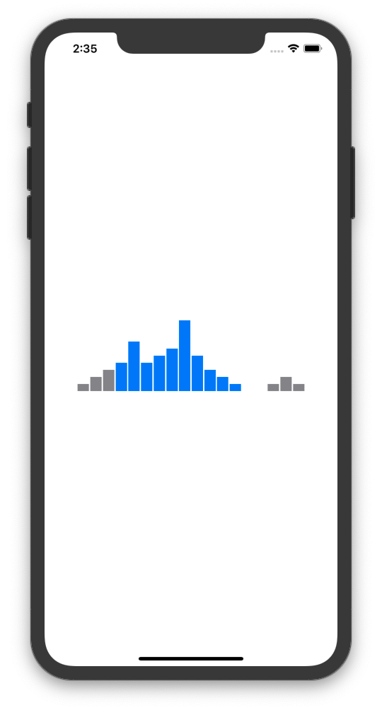
This is very similar to the ComboSlider class. We're going to change the color of the bar depending on the filter positions.
By modifiying our VStack code, we can achieve different colored bars.
var body: some View {
    GeometryReader { geometry in
        HStack(alignment: .center, spacing: 2) {
            ForEach(self.values.indices) { x in
                VStack {
                    Spacer()
                    Rectangle()
                    .frame(width: (geometry.size.width / CGFloat(self.values.count)) - 2, height: geometry.size.height * (self.values[x] / self.maxVal) , alignment: .center)
                        .foregroundColor(self.isInActiveArea(x: x) ? self.activeColor : self.inactiveColor)

                }

            }
        }
    }
}

// Returns whether or not bar is in active area.
func isInActiveArea(x:Int) -> Bool {
    let position:CGFloat = (CGFloat(x) + 0.5) / CGFloat(self.values.count)
    return position >= self.pos1 && position <= self.pos2
}
Putting the ComboSlider and BarGraph Together!
We're going to create the PriceFilter SwiftUI View in order to combine the ComboSlider and BarGraph views.
- Start off by defining your
@Statevariables. Again these will hold the state for yourComboSliderandBarGraphand allow communication between the two so that they may update with user interaction.
@State var values:[CGFloat]

@State var pos1:CGFloat = 0.0
@State var pos2:CGFloat = 1.0

@State var activeColor:Color = .blue
@State var inactiveColor:Color = .gray
- Replace the
bodyboilerplate with the following:
var body: some View {
    GeometryReader { geometry in
        ZStack(alignment: .center) {
            // Bar Graph
            BarGraph(values: self.values, pos1: self.$pos1, pos2: self.$pos2, activeColor: self.activeColor, inactiveColor: self.inactiveColor)

            // ComboSlider
            ComboSlider(inactiveColor: self.inactiveColor, activeColor: self.activeColor, pos1: self.$pos1, pos2: self.$pos2)
                .position(x: geometry.size.width/2.0, y: geometry.size.height + 5)

        }
    }
}
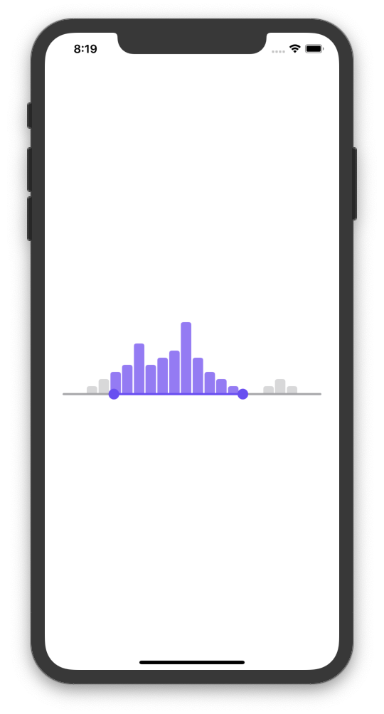
As you can see we've used a ZStack in order to place the ComboSlider over the BarGraph. In addition, the ComboSlider is pushed to the bottom in order to the be lined up with the bottom of the BBarGraph. From there we've passed the state variables to the views such as the positions and colors to use.
- Now Create a test class such as
PriceFiltertestand run the code!
import SwiftUI

struct PriceFilterTest: View {
    var body: some View {
        PriceFilter(values: [0,0,1,2,3,4,7,4,5,6,10,5,3,2,1,0,0,1,2,1,0,0], activeColor: Color(red: 124/255, green: 73/255, blue: 249/255))
            .frame(width: nil, height: 100, alignment: .center)
            .padding(.horizontal, 25)
    }
}

struct PriceFilterTest_Previews: PreviewProvider {
    static var previews: some View {
        PriceFilterTest()
    }
}